Color Theory for Quilters Who Don't Speak Art School
- Manon

- May 15, 2025
- 3 min read
So you’re standing in front of your fabric stash, holding a vibrant fuchsia and a moody olive green, and wondering: Is this genius? Or will it look like a frog fell in love with a flamingo?
Good news, friend: you don’t need a BFA to make magic with color. Just a little understanding of what colors do and how they play together. Welcome to Color Theory for Quilters Who Don’t Speak Art School… aka your go-to guide to choosing colors that don’t fight like siblings on a road trip.

Step 1: Meet the Color Wheel (But Like… The Fun Version)
Think of the color wheel as a circle of besties who sit together based on vibes:
Primary colors: Red, blue, yellow. These are the OGs. You can’t mix them from other colors. They’re the Beyoncé, Rihanna, and Lady Gaga of color.
Secondary colors: Orange, green, purple. These are what happens when the OGs party together.
Tertiary colors: Fancy-sounding combos like blue-green and red-orange. These live on the edge of chaos and fabulousness.
Quilter tip: You’re already using this even if you didn’t know it. Every time you pair blue with orange or pink with lime, you’re tapping into wheel energy.
Step 2: Color Relationships That Actually Work
Let’s talk about how colors vibe with each other:
Complementary Colors
They sit opposite on the wheel—like red and green, blue and orange, purple and yellow.
Vibe: High contrast, bold drama.
Use when: You want a pop or focal point.
Watch out for: Accidentally making your quilt look like a Christmas decoration unless that’s the goal.
Analogous Colors
They sit next to each other on the wheel—like blue, teal, and green.
Vibe: Chill, cohesive, smooth.
Use when: You want harmony or a soft gradient.
Pro tip: Add a value contrast (light, medium, dark) so things don’t blend into mush.
Triadic Colors
Evenly spaced on the wheel—like red, yellow, and blue.
Vibe: Balanced but bold. Like if a circus was also chic.
Use when: You want to use lots of color but keep it intentional.
Step 3: Value > Color (Yes, I Said It)
Here’s the secret: value (lightness/darkness) is often more important than hue (the color itself). A quilt made of different colors but the same value will look flat and a little meh. A quilt with strong value contrast? That thing sings.
Try this:
Take a photo of your fabric pull and turn it black and white.
If everything blends together = low value contrast.
If you’ve got darks, mediums, and lights = you're golden.
Think of value like seasoning. A little variety brings out the flavor.
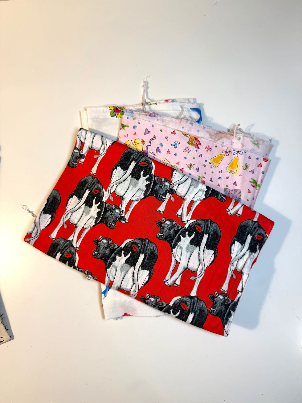
Step 4: Start with a Hero Fabric and Build Out
Not sure where to start? Grab one print you love — your “hero fabric” — and build around it.
Pull colors from that print (especially the less obvious ones).
Add contrast: If your hero is medium-toned, throw in something really dark and something really light.
Look at the overall mood. Loud and proud? Soft and cozy? Let that guide your palette.
Step 5: Break the Rules (On Purpose)
Color theory is a tool, not a trap. Once you understand why colors work (or don’t), you can bend the rules to fit your vibe. Want neon coral next to muddy olive? Go for it—but make it a statement. Want to clash in a cool way? Own it.
Confidence is the most powerful color in your toolbox.
(Okay, that was cheesy. But also true.)
The Verdict
Complementary = drama; Analogous = harmony; Triadic = balance
Contrast in value is more important than matching color names
Pick one fabric to start and build from there
Trust your eyes, not the rules—use color theory to enhance, not restrict
Your stash is your playground, not a test
Time to make some cool shit! ✂️💗
-Manon